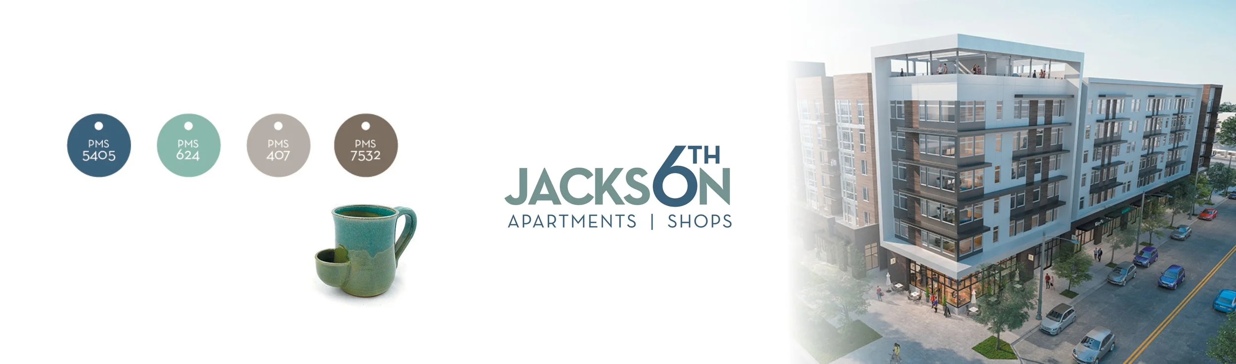
A brand palette inspired by
Japanese pottery
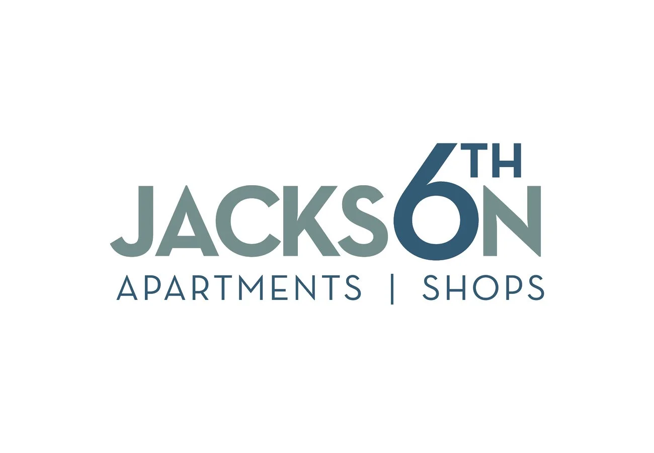
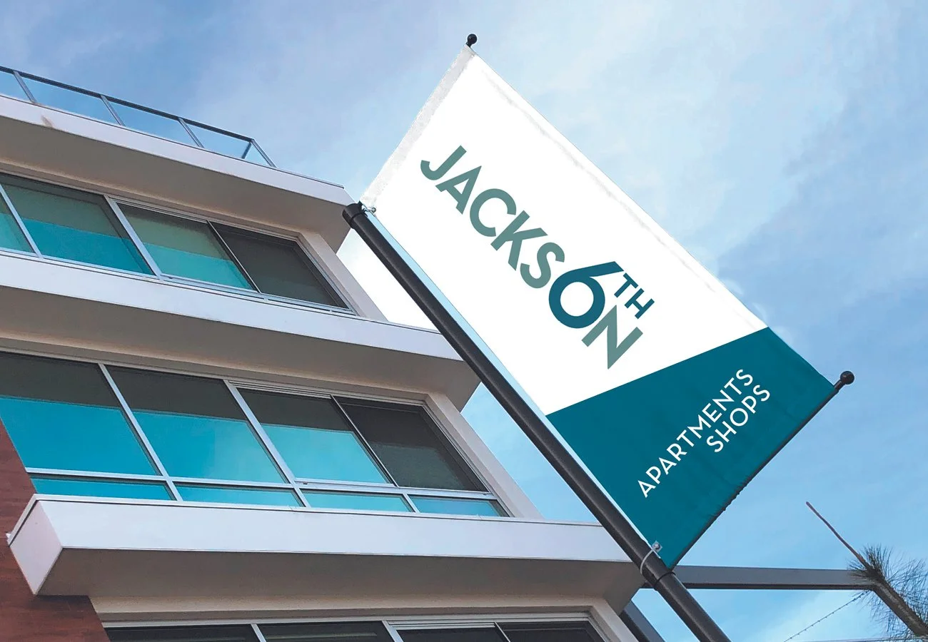
The identity for the community of Sixth & Jackson revolves around a simple, graphic, memorable word mark that uses the number six to complete the “O” in Jackson. The brands clean, bold lines and font were selected to provide a strong visual weight for use across numerous branding situations.
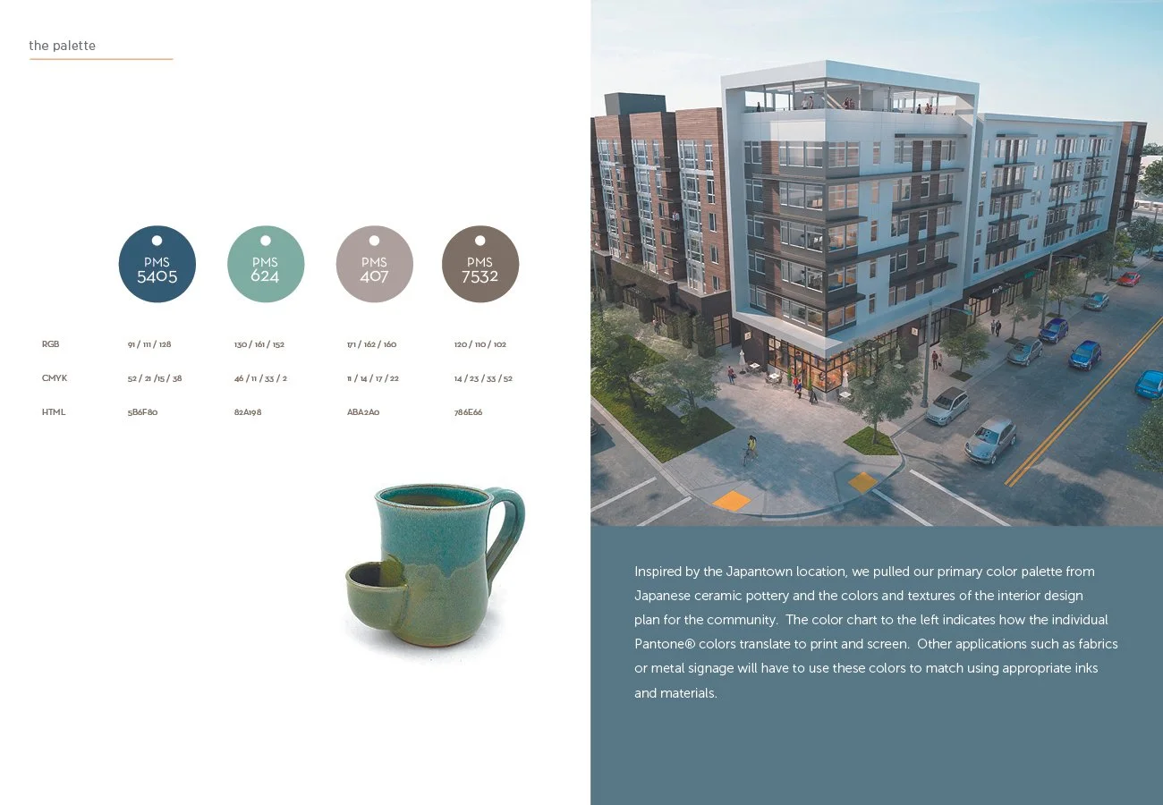
Klein+Klein created the branding for this new Shea Properties multifamily residential community. Inspired by the Japantown location in San Jose, California, we pulled our primary color palette from Japanese ceramic pottery and the colors and textures of the interior design plan for the community.