

My fascination with the color orange
Let’s get an important fact out of the way, I’m a big fan of the San Francisco Giants baseball club. I grew up in the the Bay Area so it seems fitting that they would become my childhood team. And while I listened to the play-by-play on my little radio in the bedroom rooting for Mays and McCovey one of the teams secret weapons that capture my young designer eye was not their line-up of future Hall of Famers but the color orange. It was their team color and I couldn’t get enough of it. Caps. Shirts. Sweatshirts. I even wanted to paint a wall in my bedroom orange at one point. Swing and a miss on that request.
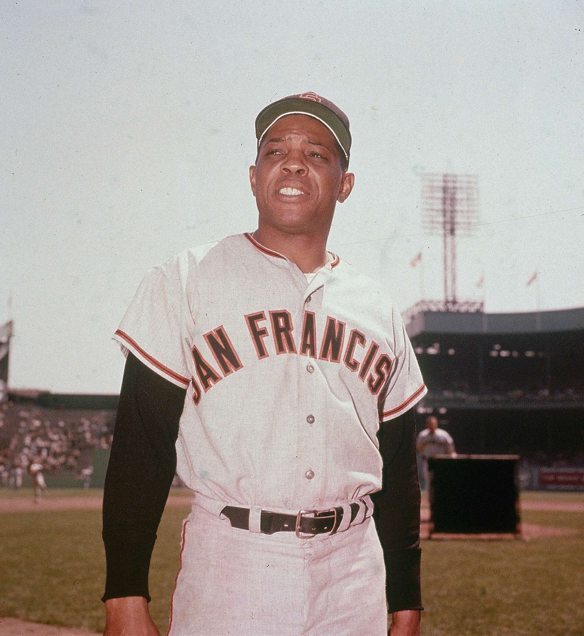
Even though the Pantone Matching System started in 1963, I didn’t know my favorite orange (Pantone 151C) existed. It would take several more years and the start of my design career at Memorex before I discovered all the current Pantone colors and the numerous shades of orange hidden in expensive fan books kept in the creative director’s office.
I see orange as a happy color. It makes me smile and I can see so many companies and master planned communities make a memorable mark with their branding and communications by using orange. What they realize is that the color represents some wonderful characteristics including enthusiasm, optimism, rejuvenation, courage, and vitality.
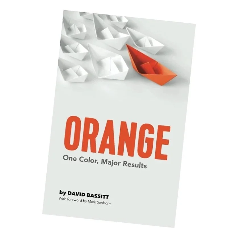
Imagine my excitement when a good friend loaned me the book “ORANGE. One Color, Major Results.” By David Bassitt. Inside was proof there was something to my childhood connection to the color and why the Giants will always be my team.
